Monday, May 15, 2017

Sand Mining Suitability and Impact Modeling with Raster

Goals:
In the final lab of GIS 2 I worked within Trempealeau County to determine sand mining suitability as well as sand mining impact in the form of environmental and cultural risk. To perform this project I had to create a suitability model of the land and create an impact on the environment model as well. I used the DEM form Lab 5 as well as using the land cover and geology of the region. In this lab we utilized the Reclassify, Euclidean Distance, Feature to Raster, Slope, Block Statistics, Map Algebra, and Project tool. Then I combined using Map Algebra, suitability, and the impact analysis to determine the most suitable locations for potential sand mines.

Data Sets and Sources:

The data used in this lab was obtained from the USGS, WDNR, USDOT, and Trempealeau county land records.

Methods:

Sustainability Model:


Site Criteria for Sand Mining Suitability:
• Geology
• Land Use Land Cover: agricultural (herbaceous planted/cultivated) land use
• Distance to railroads
• Slope
• Water table criteria

The first model I created was the sand mine suitability model. The data I used to determine sand mining suitability were: geologic units, land use/land cover, distance to rail terminals, slope, and water table depth. First, I converted every vector dataset to raster, as it would allow for easier suitability calculations. Next, I determined which criteria were most important for sand mine suitability, and I reclassified each raster to the values between 1-3, with 3 having high suitability and 1 having low suitability (Figure 1).

Figure 1. This table represents the ranks I used in my model and the reasons for which I ranked them

In Figure 2 below there are many different sets of tools each variable had to go through to get to its final stage. In the Geology Class I selected the Jordan and the Wonewoc sandstone formations which are frac sand mines target layers while giving these a 1 while the others get a 0 as they are not targeted by the sand mines. 

Figure 2. The model builder that was created for suitability. This includes tools such as euclidean distance, reclassify, and slope tool.

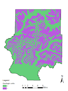
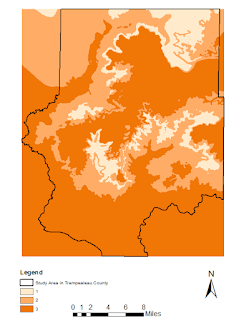
The next 6 maps shown below are all part of the suitability model. The geologic map (figure 3) has either a 0 which means not ideal formation, or a 1 which is an ideal sand formation such as the Jordan or Wonewoc formation for mining. The Land cover map (figure 4) represents the types of fields most suitable for mining frac sand. The distance to rail terminal map (figure 5) represents a less suitable mine the farther away from the terminal in Trempealeau County. The slope map (figure 6) shows that a shallower slope will be more suitable for starting a frac sand mine. The last suitability map is the depth to water table (figure 7) which gives us an idea of the shallower depth to water is more suitable to frac sand mining for the high capacity wells. The last map of suitability brings all of these other maps together to find the most suitable locations for a frac sand mine(figure 8).

Figure 3. Geologic map of  reclassified suitable frac sand formations.

Figure 4. Land Cover suitability reclassified for suitability.

Figure 5. Distance to railroad reclassified into 3 sections.

Figure 6. Slope map reclassified

Figure 7. Depth to water table map reclassified

Figure 8. Final Suitability Index using the raster calculator tool to find the greatest suitability in the Trempealeau county study area.


Impact Model:

• Proximity to streams
• Prime farmland
• Proximity to residential areas (noise shed and dust shed)
• Proximity to schools (noise shed and dust shed)
• Park areas

The second model I created was the sand mine risk index model. The data I used to determine sand mining risks were: distance to streams, impact on prime farmland, distance to populated areas, distance to schools, risk of groundwater contamination, and aesthetic implications on parks and trails. Next, I converted every vector dataset to raster, and reclassified each raster to the values between 1-3. All of the data for the Impact model and my reasoning are shown below in figure 9.

Figure 9. This table shows the five variables used in the model and how and why they were reclassified. 

Figure 10. This is the Impact model I constructed in model builder using multiple tools such as euclidean distance, reclassify, and raster calculator.

The next 6 maps below are from the impact model that I had built in model builder. The Stream proximity map (figure 11) to show the lower risk as you move farther from the streams. The prime farm land map (figure 12) represents the high producing farmland so that mines are not being created on these great agricultural areas. The residential map (figure 13) shows areas situated farther from high populations will have lower impacts on the surrounding population. The schools map (figure 14) gives an idea of how far the mine should be located from a school so it will not interfere with younger kids. The map that I was able to chose dealt with the parks in Trempealeau county (figure 15).

Figure 11. Reclassified stream impact


Figure 12. Prime farm land reclassified impact


Figure 13. Reclassified distance to populated areas within 640 m appear in the color green.


Figure 14. Reclassified distances from schools


Figure 15. Reclassified distances from parks in Trempealeau County study area

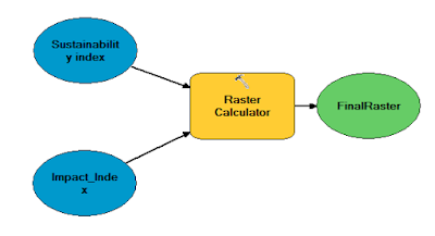
After both models were created, I used raster calculator to overlay the results of the two models (figure 16). The map (figure 17) shows where the most optimal frac sand mine locations in the southern part of Trempealeau county would be located. The green represents where low suitability areas are where as the red represents higher suitability areas are. 

Figure 16. Final raster calculation using both the suitability and impact models in model builder.


Figure 17. Sand mine location analysis of the Trempealeau County, Wisconsin study area for most suitable land to start a sand mine.

After the suitability and impact model were created, I had to find an area that would be considered a prime recreational area. The map I created below (figure 18) using the wildlife points in the county did not seem to generate a very large amount of high value recreational area. In this map I used the viewshed tool to determine if any suitable mining locations would be visible from the location.

Figure 18. Map of a high recreational area from wildlife points in the county with the green representing visible and the pink not visible.

Conclusion:


In Figure 17, we are finally able to tie everything together on one view of Trempealeau County. Being able to use all of the different tools really puts in perspective how many objects really go into making a model and deciding on a location to put something new. I know that if this was a real model there would be even more variables to consider than just the few that we used. I also see now how easy it is for someone to mess around with the reclassify tool and get a completely different map than what I currently have. Unfortunately one of the problems I could not understand is why some of my maps would clip to the Trempealeau County boundary but others did not. However I was able to produce my final map within the correct area which makes it much more pleasing to the eye. 

Thursday, April 20, 2017

Network Analysis

Goals and Objectives
The goal of this assignment was to learn how to perform network analysis and use model builder to automate the process. In order to apply network analysis to the theme of frac sand mining, we assessed the cost taken on by several counties in Wisconsin. This is a direct result of the increased traffic from overland shipping of frac sand between min and rail terminals. The method of network analysis is to help better understand the impact of frac sand mines on the county roads.

Methods
In order to use the network analysis tool, I first had to prepare the feature classes that are going to be utilized. The data that was being prepared was obtained from the Wisconsin DNR. The data I am going to work with involves sand mines that have to ship their sand by truck to the nearest rail terminal. The specific mines that were selected had to be currently active, and within 1.5 kilometers from a rail terminal. In order to select those specific mines the process used here was a python script. My results gave me 44 total mines in Wisconsin.

The next step of the lab is where network analysis is used to obtain the map routes to find the closest facility. Here the street network data set from ESRI street map along with the rail terminals in Wisconsin were used during the network analysis. I then learned how to use the closest facility tool by inputting the correct parameters such as the "incidences" are mines and "facilities" are the rail terminals.


Figure 1. Data flow model using model builder


After that step was completed, model builder was used to create a flow chart to figure out the distance and cost of each county caused by the haul trucks going to and from the mines and terminals (Figure 1). First I used the "Make closest facility layer" tool and the "add location tool. The mines were set as the incidences and the rail terminals were set as the facilities which allows me to set up my network analysis. I then had to use the "solve" tool by routes to determine the closest station to each mine. After that, I used the "select data" and "copy features" tools to create a feature class from the routes that had been solved. Next, the "project" tool was add to change the coordinates system to NAD 1983 HARN Transverse Mercator in order to get the correct measurements for later calculations. The "summary statistics" tool was used to create a table with the route distances broken down by each individual county. Once the routes were separated by counties, I could then create two different fields and calculations. The first field added was the total distance of the routes in each county. This was calculated by taking the SUM of the Shape Length of the route and multiplying it by .000621 (the amount of miles in 1 meter) to get the total distance in miles. The second field I added was to find the amount of cost each county had to accumulate annually due to the higher amounts of haul truck traffic. This step was calculated by multiplying 50 trips a year, 2 trips back and forth, total miles, and .022 for 2.2 cents a mile. The equation looked like this: 50*2*[total_distance]*.022
The numbers used for these equations are all hypothetical.

Results
The results from the model builder have been exported and used as excel data (Figures 2 and 3). In excel I created a chart that is shown below for a better understanding of the model that had been previously run.


Figure 2. This chart shows the amount of miles traveled annually in each county by the sand haul trucks to and from the nearest rail terminal


Figure 3. This chart shows the annual cost each county sustains while having sand haul trucks drive to and from the nearest rail terminal

Figure 4. The final map showing the closest routes from mine to rail terminal along with the hypothetical cost of maintenance of each county

Conclusion
This lab gave me the abilities to learn how to perform network analysis on applications used here in the state of Wisconsin. Even though these results were very unique and accurate it is all hypothetical to the actual world. This can be greatly utilized for future use and application for specific jobs.

Discussion
The data shown above is actually quite different than what I was expecting to see. The counties did not suffer very much from annual use of the roads due to the higher amounts of sand haul trucks from sand mines to rail terminals. The worst county that suffered was Chippewa county at around $600 but that would be minor compared to how many miles are traveled for the use of sand haul trucks.

Sources
Wisconsin DNR
ESRI basemap

Tuesday, April 11, 2017

Sand Mining in Western Wisconsin

Introduction
Frac sand mining in western Wisconsin has been occurring for more than 100 years. This non-metallic resource is very abundant in Wisconsin and has suitable characteristics to be used for glass manufacture, golf courses, and more recently to obtain petroleum products by hydraulic fracturing. Frac sand is quartz that has specific qualities such as grain size, rounded, well sorted, and withstands high pressures.  After the frac sand is taken out of the ground, it is washed, sorted using some sort of sieve process, and dried to be shipped elsewhere. Most of the frac sand mining facilities today are located near railroads and major highways because there is so much abundance. Shown below in figure 1 are the locations of sand mines found in Wisconsin along with the sandstone formations outline in the state (Wisconsin Geological and Natural History Survey, 2012).


Figure 1. Frac sand mines and sandstone formations in Wisconsin

Much of the desired qualities for frac sand mining discussed above lie in certain formations in western Wisconsin. The formations that contain this frac sand include the Wonewoc, Jordan, and the St. Peter sandstone formations. These formations were formed during the Cambrian and Ordivician when shallow marine seas had covered western Wisconsin. Figure 2 shows a geologic map of the Midwest with the Cambrians Wonewoc and Jordan formations in red and the Ordovician St. peter sandstone in yellow (USGS Geologic map of North America Adapted from the map by J.C. Reed, Jr. and others 2005)
Figure 2. Major formations in Wisconsin for frac sand mining

Issues with frac sand mining in western Wisconsin
With the development of frac sand mines there are also problems that must be dealt with to proceed with the removal of the non-metallic resource. First, the companies must get permits from the city and state governments to allow the mining to continue. There are always concerns when it comes to the environmental aspect of mining.  This includes air emissions that are released during extraction, blasting, crushing, processing, and transportation of frac sand. Another issue that needs to be looked at after the mine is finished or used up the resource, they must think about reclamation processes required by the DNR. The DNR can however provide assistance to help create a good reclamation plan in order to create a more sustainable area.

GIS usage for further exploration
During this semester, my skills in GIS will be put to the test while I try to solve problems and the way in which I solve them with the frac sand industry. I will be using my skills to analyze data that I can acquire through various sources to better understand some of the environmental hazards created during frac sand mining. In this case, western Wisconsin will be my area of interest for frac sand mining and its environmental hazards.

Sources:
National Center for Freight and Infrastructure Research and Education. 2013. Transportation Impacts of Frac Sand Mining in the MAFC Region: Chippewa County Case Study. Retrieved February 27, 2017.
http://midamericafreight.org/wp-content/uploads/FracSandWhitePaperDRAFT.pdf
USGS. (2012). Frac sand in WI. Retrieved February 27, 2017.
dxm
WDNR. 2016 (last revised). Industrial Sand Mining Overview. Retrieved February 27, 2017.
http://dnr.wi.gov/topic/Mines/Sand.html
WDNR. 2012. Silica sand mining in Wisconsin. Retrieved February 27, 2017.

Wednesday, April 5, 2017

Exercise 6: Normalizing, Geocoding, and Error Assessment

Goals and Objectives

This lab required tedious normalizing of excel data about sand mine address locations that were not completely filled out correctly. The goal of this lab was to take those address and geocode that set of data given to us. We used this data to achieve a greater understanding of how normalization is key to providing correct reference data. The more accurate your data starts out with, the easier it is to geocode and locate the mines on the map.

Methods

The first step into this lab was to obtain the sand mine data that was given to me, and normalize the data in an Excel spreadsheet. I had to add new fields such as Street address, zip-code, and state in order to work with the geocoder (figure1).

Figure 1. Excel data given to me and normalized on the specific mines to geocode and locate

After normalizing the data was finished, I could now bring the table into ArcMap and use the geocoding tool. I had to set up the geocoding tool by selecting the correct columns, for example, Address to field Adress, City to the field City, and so on. The geocoder used was the "World Geocoding Service" to find and match the address. Even though there was a high percentage of matched locations, I still went and located and moved over half of them. I was able to geocode most of the addresses but some of the mines were only in the Public Land Survey System (PLSS) (figure 2). These mines that were only in the PLSS had to be manually located by using the description within the excel spreadsheet and the Wisconsin DNR data. In order to manually place the points, in the Interactive Rematch window for geocoding, I used the "Pick Address from Map" to relocate a specific point for it to be correct (figure 3). 

Figure 2. The results window after geocoding the sand mine data.

Figure 3. Interactive Rematch window where the "Pick Address from Map" tool is located near the bottom.

Lastly, I compared the results of my geocoded addresses with those of my classmates and those of the actual locations given to us by the WDNR. This required the use of the merge tool to input multiple datasets into a single new output dataset. Next I created specific layer by using query to specifically locate the mines I was assigned so they match up with the mines of my classmates and the mines of the actual locations. To find the distance between my specific mines, classmates, and the actual, was found using the Near tool and the average error was found using Statistics within the Near_Dist field.

Results
Map 1. Map of western Wisconsin Locating the differences in the mines that have been geocoded and those of true location.

In the map above, there was both location errors of a large magnitude and some that were less than 200 meters off. This is also shown in the data in Figure 4 below. Comparing data with my classmates had a larger average error to location distances than the actual locations (Figure 5). 

Figure 4. The queried mine locations between my own and the actual mine locations to show the error distances.

Figure 5. The queried mine locations between my own and some of my classmates mine locations to show the error distances.
Discussion

Multiple reasons come up to why there is such a difference in the distance between the geocoded points and the actual mine locations. In Lo they are listed out and discussed in a table. Gross errors is one that comes up but should not occur with this data because they are all assumed as sand mine locations. However, there could possibly be some systematic errors found within the data. A reason for this is the fact that not all of the mines were shown on the base map making it harder to be as accurate as possible. There could also be some random errors which would happen from either making a simple mistake or moving a point that was not supposed to be moved. This lab was a great lesson in learning how the different errors can really change the data results. Its very important to have accurate data when your using real life decision making skills. 

Inherent errors can be a large source of the errors in geocodings. This is when errors are made while digitizing the data the fact that each dataset was created differently by each of my classmates can mess up the data and therefore be misunderstood. Operation errors were also a considerable part of the lab because most of the students may have used the data incorrectly or made a mistake when inputting or using the data.

In order to get the correct points compared to the ones that are incorrect, a great way to go about it would be to obtain a complete list of all the addresses of each mine. Without this information however, as a group we could go through each point individually and discuss where the correct address is located on the map. Another helpful measure is acquiring the latitude and longitudinal data for each of the mines.

Conclusion
Normalizing data, understanding the data, and accurately using the data is extremely helpful when geocoding in ArcMap. In order to make the process easier, having a set of rules to the data would allow for a smaller chance of error later on. 


References:
Lo, C., & Yeung, A. (2003). Data Quality and Data Standards. In Concepts and Techniques in Geographic Information Systems (pp. 104-132). Pearson Prentice Hall.

Wednesday, March 8, 2017

Data Gathering

Introduction

In order to understand the impacts of frac sand mining in western Wisconsin, data from various amounts of sources needs to be obtained to have sufficient and effective results. The goals of this lab is to promote the skill of file management, use python coding to create a geodatabase from the downloaded data, and be able to extract that data from various sources.

Methods

The beginning stage of this lab was to extract data from multiple sources on the internet. Extracting this data includes downloading, and unzipping the files into the correct folders for working purposes.
·         The first downloaded data came from the US department of Transportation. This included a Railway Network ZIP from the Bureau of Transportation Statistics website.
·         Second, the USGS National Map Viewer allows you to download data that includes the National Land Cover and Elevation information from their website.
·         Third, the USDA Geospatial Data Gateway provides land cover data in their website.
·         Fourth, the Trempealeau County Land Records division website holds various amounts of data such as boundaries, emergency, transportation, streets, etc.
·         Lastly, the USDA NRCS Web Soil Survey data for Trempealeau County Wisconsin was downloaded from their website.

Data Accuracy

Scale - relationship between depiction on map and its actual size in the real world
Effective Resolution – The smallest identifiable object on a map at a specified scale.
Minimum mapping unit – A features ability to be reasonably represented by a line and an area by a point at a given scale. 
Planimetric Coordinate Accuracy – The closeness that objects are to the real location on the Earth. 
Lineage - Documentation that shows how the data was collected, used, and by whom.
Temporal accuracy - How up to date the data is, and when it was published. 
Attribute accuracy - How accurate the data is represented when compared to real world.  The data is then recorded as a specific number for metric attributes and as an accuracy percentage for categorical data.


Conclusions

This lab was pretty challenging but gave me great experience on manipulating the data to correctly display it in a map.The classification list for Land Use/Land Cover was quite large so I grouped multiple values together in the legend. At first I had trouble organizing the data into a correct folders and geodatabase, I realized how important it is to keep certain files separated from one another. It especially makes a difference if you take a break from it a day or two and have to find where the data you need is located. I learned quite a few skills from this lab and will probably use them with future projects.

Python Scripts

Introduction:

Python is a computer programming system that is very user friendly is and is incredibly easy to pick up with a small amount of help along the way.  I found it easy to understand, and easy to find help using ESRI's online help function to guide myself through the process. 


Script 1

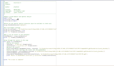
Exercise 5 I wrote out a script to project, clip, and load all of the data into a geodatabase. There was a loop code that was needed to loop through the rasters in the workspace. The code then decides whether or not it needs to be changed and will put in the correct projection.